How Presentation Impacts Game Mechanics
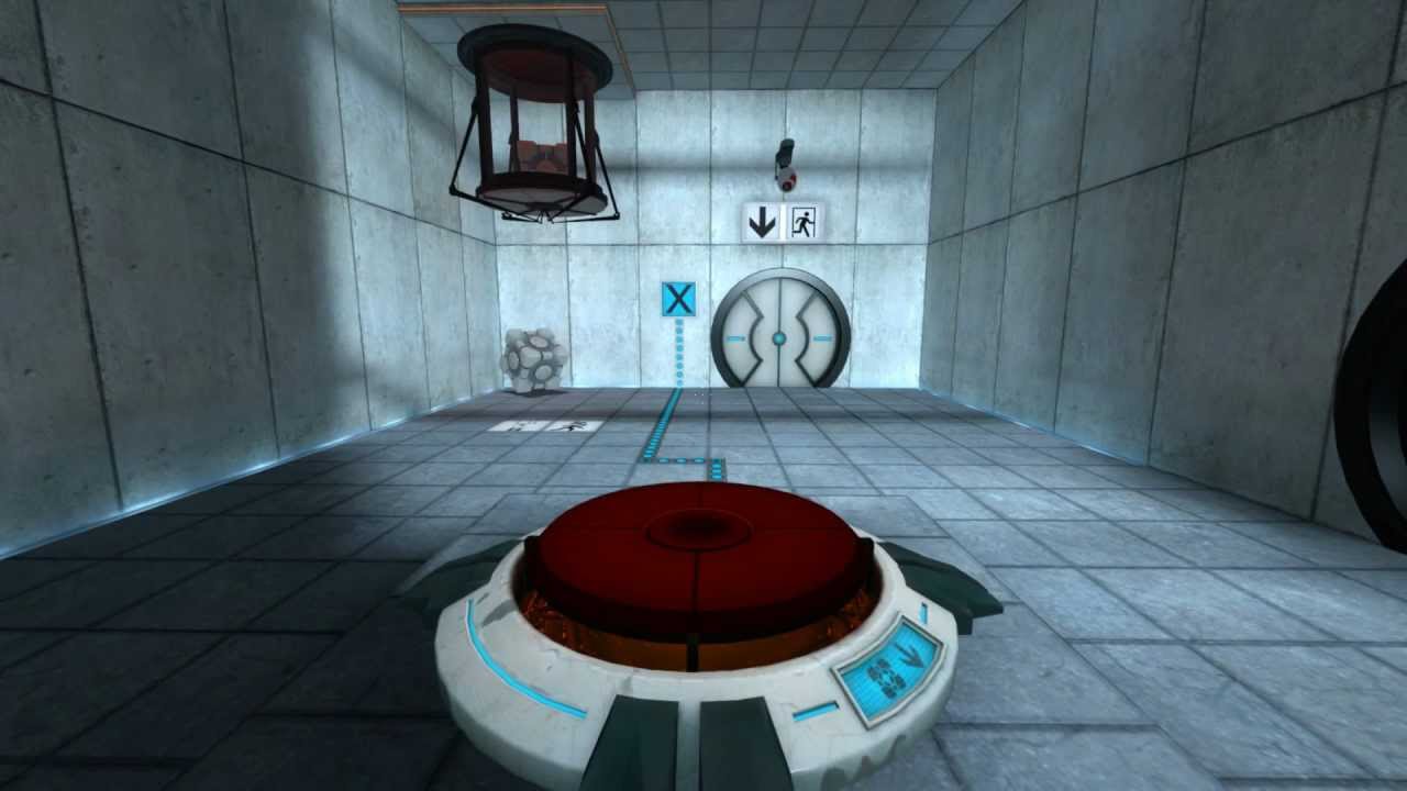
A group of developers have invited you to test their new game prototypes . As the first game begins, you find yourself in a room with a button on the floor and a locked door. You stand on the button and the door opens. You walk through and the game is completed. It may be very short, but it’s a solid prototype to build upon.
You move on to the next developer’s prototype. The game loads, and you’re standing in what appears to be a shed. There’s a worktable in the center, shelves across all the walls stacked with an assortments of tools. In the corner are boxes of gardening supplies. Once again, there is a locked door. You start searching for a button, or a switch, with no success. Perhaps you need a key, that’s hidden inside a box. You try pushing crates, crawling under tables, hitting the door with a hammer; nothing seems to work.
In frustration you ask the developer what to do. They say, “Isn’t it obvious, you have to stand on the plant pot and the door will open.”
Portal (2007)
There’s never anything red inside a test chamber that isn’t a button.
I’m sure we’ve all experienced this situation before. A game mechanic that appears to defy all common sense and logic. Yet in both of the prototype games, you actually experienced the same mechanic.
Standing on objects opens doors.
The reason the second game was a terrible experience was not because of the mechanic itself, but instead due to poor presentation of the mechanic. Specifically the mechanic lacked an intuitive visual design. This distinction is key in understanding how mechanics can be improved.
The mechanic is the underlying system of rules that determine the outcome of specific actions.
The presentation is the visual and audio output that allows the player to understand what the mechanic does.
Now we’ve established the difference between the mechanic and it’s presentation, I’m going to tell a story about how a small change in the presentation of a mechanic in Nocturne improved the game.
Nocturne (TBA)
The old talent menu from an earlier build of the game.
The mechanic is simple; passive abilities which benefit you in combat. You can see some examples of these abilities in the above image. I decided to present the mechanic as talents, which you can learn by spending energy from leveling up. Each talent had two upgrade paths to improve it.
The actual mechanic functioned well, but during playtesting a few issues came up as a result of the presentation:
The energy system required to learn talents had no context or explanation.
Players didn’t realize you could unlearn talents.
You couldn’t learn both Upgrade A and Upgrade B but it was unclear why.
Players were paralyzed by choice. They had 9 talents and 18 upgrades.
Now there’s many things we can do to resolve some of those presentation issues, but instead I chose to do something more drastic. I took the base mechanic of passive abilities, and I completely changed the presentation.
Nocturne (TBA)
New equipment menu from the latest build of the game.
That’s right. Talents got scrapped and equipment took it’s place. Now you might be thinking it’s an entirely different mechanic, but the equipment does exactly the same thing as the talents previously did; they provide passive abilities which benefit you in combat.
The new equipment presentation fixed all the playtester’s issues:
There’s no need for an energy system anymore, now the player unlocks new passive abilities through obtaining new equipment.
It’s obvious you can unequip items, that needs no explanation.
Upgrades are now handled by finding better versions of the item.
Choice is easier when you find 1 item at a time and slowly build up a collection.
What’s really great about this presentation change, are the new possibilities it unlocked:
Players now have more reason to explore the map to find equipment.
Currency now has more purpose by allowing players to also buy equipment with it.
More control over player progression as they can no longer just grind levels to unlock all the talents.
While I could have done a few of the above things with the old talent system, none of them would have been as intuitive. I could have created an item which provided additionally energy when used and hidden those around the map, but all I’m doing is adding more features that need a wall of text to explain them. When you pickup a metal helmet, everyone already knows what to do with it.
Final Fantasy X (2001)
Can new players look at the presentation and understand how the mechanic works?
So next time you go to add more text explanation and visual complexity to the presentation of your mechanics, take a step back and ask yourself if the entire presentation can be simplified with a new design.
I’ll leave you with some key points on creating good presentation:
Consistent: If the green button heals you and the red button kills you, don’t have a green button that kills you.
Intuitive: You shouldn’t need to read a wall of text to understand the mechanic.
Feedback: When the enemy heals, you should both see and hear the mechanic in action.
Bullet Points: This might actually be a tip for writing blog posts about game design.


